going underground to a novel format: the magazine as paperback…
Art Chantry (art@artchantry.com ):
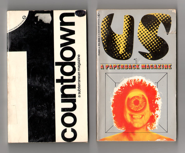
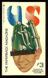
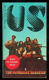
These two little paperback books are actually NOT paperback books at all! they look like paperbacks, are printed like paperbacks, published by paperback publishers and even cost about the same as a paperback. but, they are not paperback books! they are paperback MAGAZINES.
Back in the late 60′s, when the counterculture finally started to usurp the mainstream, just about any cultural creative experiment went up for a try. Both of these little magazine represent a much larger attempt to meld the two formats and create a magazine with the prestige of a book, or possibly vice versa, depending on your value structure. These two mags came out about 69/70, as did many others. None of them survived in this format. None of these paperback magazines survived at all (i’ve never found an actual ‘issue #2″ of any of the titles.) Even the venerable and proud “Evergreen” magazine switched to paperback book format for a few issue before it keeled over and died forever. This experiment just didn’t work at all. saddest of all, very few of these magazines ever survived the shredder and the landfills full of paperback books. They seem to be extremely rare. Too bad.

art chantry:of the two mags i display here, 'countdown', though being the more 'relatively' conservative design style (think: quentin fiore), is the more radical written content. it openly preaches revolution. 'US', on the other hand, has the wilder "cool hipster" content culturally, but had a much more predictable standardized magazine style formatting. it could literally be a magazine layout. so, they are a rather mixed up bag
Coincidentally, very soon thereafter, there emerged the ‘trade paperback’ format, which melded the physical impact of the hardback book and the cheap disposability of the paperback. It might be said that the experimental paperback magazine lead the way into that trade paperback revolution.
What i find so interesting beyond the mere fact of the existence of this strange short-lived format is the design and content is quite striking. “Countdown” boasted contributers like Jerry Rubin, Eldridge Cleaver, Gary Snyder, Diane de Prima, Timothy Leary and an interview with the MC5. “US” has contributions from Ed Sanders, Jim Morrison, Robert Crumb, Robert Christgau, Richard Meltzer and Jon Landau. very impressive line-ups, both.
However, from a design perspective, I find these two magazines rather a stunning contrast. The content of both was designed to appeal to exactly the same audience (i mean, compare contributor lists!) yet one (countdown) is mired in the sweet modernist “big idea” academic design school look that reached full fruition in the mid sixties. While the other one (US) is experimenting with the new young hip rebellious style emerging at the exact same time. The conflict that began as these two styles met head-on in the late 60′s/early 70′s cemented a larger cultural division- a ‘schism’, really – that separated popular design language into two major camps – both representing major philosophical world views.
The “US” style became the graphic language of commercial populism, the style used to sell enormous amounts of crap and trash food and addictions to a couple generations of “kids”. The “countdown” style evolved over time into the private language of power and corporate america (strangest of all, when “punk” came along it soundly rejected BOTH styles and retreated into an even older dialog of rejection.)
Even though BOTH of these experimental magazines were trying to talk to the same people, those people were in a cultural civil war – one that continues to this day. It’s an interesting lesson to learn when you contemplate this graphic style
ergence occurring at this period in American popular cultural history. Both camps pursued their own visions, their own differing paths toward their similar ideals and both quests have failed miserably. There are now several new cultural generations emerged since then, all speaking their own language and pursuing their own values. I assume they will fail, too.
But, it’ll be really fun to watch what happens next.
ADDENDUM:
Art Chantry: “travel guide” style entertainment publications always attempted “pocketbook” size formatting (they even pioneered the “tall skinny” format.) that way you can stick in your hip pocket to carry around while playing tourist.
there are real practical reasons for a lot of design formatting. we just don’t pay that much attention….. i doubt that idea would have even occurred to them back in 1969. “targeted retail niche” of “hippie” wasn’t a practical concept. the popular notion was that the end point readership for mags like this were dirty stupid crazy broke malcontents – hardly a viable ‘demographic marketing niche.’


 COMMENTS


