There are just some things more important than money. That may be a heresy in America, but its truth…
Art Chantry ( art@artchantry.com ):
A while back I wrote about ‘fake psych’ (or as i like to call it, “hallmark psychedelia”). It’s what happens when corporate money making interests tried to cash in on what they saw ‘the kids up to’ back during the hippie era. It resulted in an odd style that is subtly, yet distinctly, different than REAL psych.
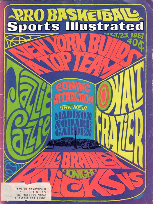
This August 23, 1967, issue of Sports Illustrated is a perfect example of what I’m talking about. It doesn’t get much more mainstream and corporate than Sports Illustrated. So, who were they trying to ‘speak’ to when this cover was crafted? I assume the hip young fans as they imagined them. And all ‘the kids’ were into this hippie shit – “it’s the happening thing, baby!”
AC:but, you damn well know - there is out there somewhere the ANTI response to walmarting (and this horrid 'cultural state of the union'). just exactly what it is and where it is and what it LOOKS like is probably not on our radar yet. so, i think it's time to start holding your breathe - we're in for a big change real soon. it'll be delicious to watch...
So, their art director looked at a bunch of portfolios from his reps and found a hip young professional illustrator guy who said he could do ‘that youth look.’ The result is this cover. It’s basically some professionally trained commercial illustrator/artist trying to look like a hippie psychedelic artist. You have to admit, if you don’t know anything about psych art, this actually sorta looks like it. It’s just like those paint-by-number landscapes look just like a Gainsborough to the amateur eye. But, it sure ain’t.
It’s pretty easy to spot fake psych. It’s unnatural looking. All the edges are crisp and mechanically rendered. It actually has a structural plan that is visible (aka – a ‘layout’). It looks like something that was done by a machine. It’s ‘industrial’. even the letterforms are clearly readable. That’s because the creators of this fake version of the psych style couldn’t excape it’s function – it was trying to convey a message LITERALLY first and foremost. “it ain’t nothing if you can’t read it” was the mantra of advertising of the time.
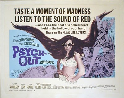
image: http://psychedeliclion.blogspot.com/2008_06_01_archive.htmlAC: everything was decidedly UNcoooler then. those folks were HATED. the dorks and losers and dweebs that the cool people despise are the ones who do all the cultural lifting around us. today's twit is tomorrow's hipster. the motto of the 'grunge revolution' (such as it was ) was: "the loser is the existential hero of the 90's." so be it and always...
REAL psych was amateurish and organic. It was freehand and loose. It was actually trying to scare away straight people from the events because they were a drag on the proceedings. Part of the ethos of a subculture is ‘like talking to like’. So, when you posted a ‘community’ meeting (a concert or be-in) you wanted to attract YOUR people, not strangers. So, the basic idea of the visual form was to speak in the language that only other stoned hippies could read. In fact, they didn’t even want the posters to be legible by straights. If they can’t read it, they won’t come. Psych posters were ANTI-graphics (just like punk posters with xeroxed dead babies on them).
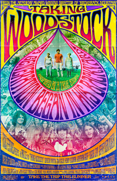
image: http://www.towleroad.com/2009/04/ang-lees-taking-woodstock-gets-a-psychedelic-onesheet.htmlAC:i'm troubled by whatever we think is 'cool' these days. we are all so bought and sold on cool - it's become a cash commodity more than ever before. we're are sold 'cool' like it was a mouthwash. so, whenever i hear that word, my BS meter starts to redline. be sure you aren't confusing 'cool' with 'retro' (which is the new post-postmodern word for blind aping version of appropriation).
In
t, just like those punk graphics years later, the ‘normal people’ were actually terrified by psych posters. They disturbed their peace of mind. It upended their apple carts. When they saw a poster they couldn’t understand at all, it was like being poked in the eye by a sharp stick from a different dimension (and NOBODY likes that!)
People actually attacked and destroyed punk posters on the street. I watched crowds of straight people literally tear my posters off the walls and shred them in their hands (and then applaud.) I imagine the same thing happened to psych posters at the very beginning.
So, when you see this fake corporate rendition of psychedelia show up on Sports Illustrated (of all things), it didn’t take very long – only a couple of years. The glory days of the hippie scene was the year 1965 (and a little of 66). By the infamous ‘summer of love’ (1967 – when this issue was published) the original hipsters had all split because of the tourists and runaways and the general exploitation had descended and ruined their little world. It was also when the heroin dealers descended en masse on the scene cashing in. I assume it was exactly like being in Seattle Washington in 1991/1992. A shark infested feeding frenzy. People began to die. It was frightening to see.
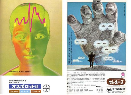
Read More: http://www.tomorrowland.org/slime/altered_states/ 1970.Fascinating gallery of Japanese psychiatric advertising from vintage medical journals. Mostly pharmaceutical-related, the ads demonstrate a bleak, haunted aesthetic that flirts with the surreal in several ways. Madness, nightmare, hallucination and paranoia inform the entire gallery. It's the absolute antithesis of today's cuddly Zoloft blob anti-anxiety advertising. Selective serotonin reuptake inhibitor, anyone?
Seeing this sort of thing exploited by big business for profit must have disgusted and even terrified the people who built this hippie culture – just like seeing ‘grunge’ fashions on the catwalk made Seattle scenesters laugh and groan simultaneously. It was silly. Fake psych looks silly. And it was dangerous. It was an armageddon to their world.

Read More: http://www.tomorrowland.org/slime/altered_states/ Net magazine cover by Saiman Chow Great article in the new Print magazine about contemporary psychedelic design. Author James Gaddy might be the first to successfully articulate this new wave "aggressive sensory overload" aesthetic. It's a look embodied by Black Dice album covers, Stardust advertising, and the work of Saiman Chow (look up!). The parallels to 60s design are legion, from the "rebellion" against sober forebears to the supersaturated colorburst palette. From the article: "Like the prism on the album cover of Pink Floyd’s Dark Side of the Moon, this...
The big issue here is that subculture is the injection system for new ideas in our culture (not academia or think tanks or new york city, like the professionals tell us). Weird little outsiders festering among themselves develop great new ways of looking at the world. If their ideas are profound and impactful enough, they get usurped by the mainstream culture and become part of our everyday lives (where it turns into a cliche). And that is how all of this popular graphic design language disseminates through subcultural channels.
The irony is that th truly successful subcultures get destroyed by this process. They get eaten by the sharks. The punks had it right when they believed in nihilism – death is success in our culture. DESTROY!
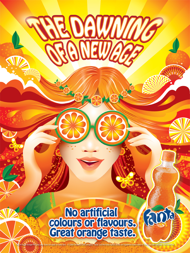
Read More:http://rebeccawolkenstein.com/latest/category/advertising/page/3/AC: i also need to point out that i knew von dutch (we had a correspondence). i've also chatted with his daughter. so, i really honestly there is no way that von dutch would be into having his name on walmart crap like that. and i also can plainly see that his family was attacked by a shark and eaten. i don't think his daughter really knew what hit here when she sold his legacy for money. still doesn't.
ADDENDUM:/wp-admin/media-upload.php?post_id=35413&type=image&TB_iframe=1
Art Chantry:well, money is always tight and when some fast talking slicker comes roaring into your life waving cash, and you’re hungry, hurt and a little desperate – you “do the right thing”. in america, the right thing is ‘grab the money and run’. but, they sorta got a bum deal, ya know? so did dutch. so it goes….it’s the way this stuff is supposed to wrk. subcultures get eaten by the mainstream (if they’re lucky)….yeah, gotta admit that things get pretty smudgey when you get close to that ‘line’ between real and fake. i mean the examples you mention are pretty close to walking that line….
…
and THAT is exactly where cross-cultural contamination exists and where the infection of the mainstream (and destruction of the subculture) happens . it;s the point where the virus breaks through the cell wall in order to kill that cell (and itself in the process). i think it’s fascinating…. it’s sort of like ‘new wave’ after punk. it became a ‘hallmark’ style fraud, too. it walked that line and killed everything off….well, my vote is that something truly radical is going to emerge from the internet somewhere. i mean, you have free interaction among all these zillions of minds squishing around in almost random ways – lord knows where this thing is headed. there is no prediction that goes far enough. so, i am keeping n eye on this medium as the source point for change in a massively cultural way. it’s already starting to happen….


 COMMENTS


