by Art Chantry ( art@artchantry.com)
william golden designed the brand/identity/corporate graphic system (and, of course that amazing logo) for william paley’s CBS broadcasting corp. back in the late 40’/early 50’s. with this incredibly sophisticated and extraordinarily smart effort and his impeccable tasteful vision, the world of coprorate graphic design opened up and became a reality for the newly coined “graphic design” profession. after the path trailblazed by william golden, a hoard of post-war vets (powered by their exposure to the design thinking of europe for the first time), along with the displaced european designers, transformed the world of signpainting and commercial art into the powerhouse sub-culture of “fine graphic design”. the design subculture as we know it today was born from this first foray into re-definition. where is william golden today in the annals of design history? barely a mention. he died young, so he was written out of the historical record in favor of the guys who followed him and outlived him (mostly his ‘young lion’ competitors. guys like paul rand). “the victors write the history books.”

---when i'm approached by an 'art director" today, he's actually usually a new hire straight out of school who wants to hire his "childhood heroes" (like me). really dumb selecting criteria. i get asked to do the most completely inappropriate projects as a result. they get rejected by the mysterious 'superiors' higher up the food chain and then the project gets killed but he lawyers (who are defacto editors). a few years back, i realized my entire year's income was all kill fees from this wretched scenario. it's bad out there.---AC
golden also had the foresight and humility to spot and nurture great talents. he hired a young guy named lou dorfsman and taught him the ropes (and lou dragged along his buddy, herb lubalin). he hired the ealy genius who defined what tv graphics could actually look like – george olden. his work is well worth trying to find out there. it’ll blow you away – especially when you realize he was INVENTING the stuff as he worked along. his work actually created the language that telelvison still uses today to speak on a visual level. it’s also worth noting that george olden was a black man. this was the early 1950’s!
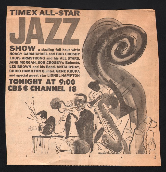
but, william golden also invested in artists of merit to hire free-lance. he employed work by illustrators big and small, great and unknown. he hired guys like lubalin and ben shauhan and a very young andy warhol (very young). and he hired this guy to do the appropriate work for this advert for a jazz tv special – david stone martin. well, actually by this point his assistant, lou dorfsman, had replaced golden (who suddenly died.) dorfsman went on to execute one of the most solid design histories of any major corporation – CBS. a stunning achievement.
when lou dorfsman hired david stone martin to do this remarkable (and crappy) little newspaper advert, martin was no unknown starving artist. he was the LOOK of jazz. all of the early BOP and cool and dixieland and blues and even late swing music weren’t really considered a ‘classic disk’ unless david stone martin designed the cover image. he did covers for louis armstrong, lester ‘prez’ young, billie holiday, ella fitzgerald, dizzy gillespie, chet baker, sonny rollins, thelonious monk, art pepper, lionel hampton, count basie, etc. etc. etc. he did hundreds, maybe thousands of record covers. most of them were 78’s.
when people thought about JAZZ, they thought of martin’s squiggly little line style (with wash). in fact, he was so popular that there were dozens of imitators to his throne. even andy warhol’s early illutsration style owed as much (or more) to david stone martin than it did to the more popularly credited ben shauhn. but, this is EARLY jazz. when reid miles covers for blue note records (and others) hit the stores, the way jazz LOOKED did a 180 and david stone martin was forced to relinquish his “creator of what jazz looks like” crown to the then unknown reid miles (who didn’t listen to or like jazz – but that’s another story).
this advert displays david stone martin’s remarkable style very nicely. when lous dorfsman made this assignment, it was because he wanted the single most appropriate illustrator possible to create the image for this program presented. unlike today, when ‘art’ directors simply download a stock image from the web and ‘tweak’ it to fit, or (at best) hire a buddy to draw a picture and tweak that instead. the art and craft and just plain WISDOM that went into the job of directing editorial artwork was so refined and knowledgeable that, by today’s standard, such a thing would be impossible. besides, we now have at least two whole generations between the old job description of ‘art direction’ and the new current description. this craft has been almost totally lost now. there are very few decent ‘art directors’ out there – “decent” meaning somebody who actually KNOWS how to do that job.
if a current ‘art director’ were doing this advert in these circumstances today, the idea of hiring THE david stone martin to do this illustraion in the 100% appropriate manner (probably for peanuts, too) would never happen. the ‘modern’ art director would instead show a few album covers (unknowingly with david stone martin’s work on them) to a young free-lancer (probably a school pal) and tell him to copycat the look.
that’s referred to as: “close enuff for jazz.”


 COMMENTS